The 2024 Cities Bikeshare Data Quality Ratings
By Jeffrey King
Welcome to the inaugural Bikeshare Data Quality Awards! This year, 23 city bikeshares unknowingly compete for the honor of having the highest quality bikeshare data. No city invited me to scrutinize their data, but "the true test of a city’s character is the data it shares when no one is watching" (John Wooden, fictitious city mayor). Let’s celebrate the cities delivering smooth rides and give a gentle tire pressure warning to those lagging behind on their data sharing.
The Journey Ahead
The Rating System
The wheel chart below shows the five spokes on which we'll be assessing each bikeshare's data.
To evaluate each system's data, we'll check whether the data is
- Complete - Are all critical pieces of info, such as start time, end time, start station, and end station provided? (2x)
- Processable - How easy is the data to process? (2x)
- Accessible - How simple is it to download the data? (1x)
- Fresh - How often is the data updated? (1x)
- Documented - How well is variation in the data documented (e.g. different csv headers)? (1x)
Each system earns a score out of 5 for each category, multiplied by the weight listed in parentheses. A letter grade is assigned based on the final score.
Process
To measure a bikeshare's data quality, I processed the data available to create a single file that contained every trip since the bikeshare started operating. This included:
- Downloading the available data.
- Cleaning the data to handle issues like null data and inconsistent headers
- Merging data into one single parquet file, handling any inconsistencies in data between the files
For consistency across systems, the final file included only four key data points: start station, end station, start time, and end time. Once the data was merged, Once the data was merged, I analyzed it to determine how many trips contained missing values for any of these fields. The full process, along with the code, is documented on Github.
Results
Before diving into the results, let’s applaud these unsuspecting cities for sharing their bikeshare data. Some may have earned lower ratings, but every city here is leagues ahead of those that keep their data locked away. Without further ado, let’s hit the road!
A+ Cities
Leading the pack on a smooth, fast ride, these cities offer exceptional data quality - complete, consistent, and accessible like cruising down a perfectly paved Amsterdam bike lane.
None. Maybe next year!
A Cities
Pedaling confidently toward the finish line, these cities provide great data quality with smooth paths and only minor detours along the way.
Bergen
Oslo
B Cities
"Cruising through, these cities offer good data quality, but occasional bumps and gaps slow the progress."
Trondheim
Austin
Chattanooga
Toronto
Philadelphia
C Cities
Coasting through uneven terrain, these cities have everything required to make the journey possible, but unclear routes, gaps, and inconsistencies make for a bumpy ride.
Boston
Jersey City
Los Angeles
Helsinki
Guadalajara
London
New York City
Washington DC
D Cities
These cities have numerous defects, leaving riders to navigate the many roadblocks and find the best path to take.
Pittsburgh
Columbus
Taipei
Montreal
Chicago
San Francisco
Mexico City
Vancouver
E Cities
The following cities once share their bikeshare data, but have stopped, leaving riders, and their tires, deflated.
- Portland - shared its data openly up until 2020. Now only shares aggregated data through Ride Report
- Madrid - shared its data up until February, 2023
I reached out to both of these organizations, and was pleasantly surprised to receive a prompt response, but unfortunately, there are no plans to start sharing data in the near future.
F Cities
Failing to show up to the starting line, these cities don’t share their bikeshare data at all.
Every city not listed above. But I'll call out a few that I wish would share their data:
- Bogotá
- Paris
- Hangzhou
- Barcelona
- Tokyo
Riding High in the Land of Fjords
Before diving into the exact grading scale for each category, let's explain why Oslo and Bergen stand head and shoulders above the other cities in terms of data quality.
Oslo
Bergen
Trip data for Oslo and Bergen are 100% complete. These two cities and Trondheim, are the only three systems that update their data daily. This combination of timely and complete data propel Oslo and Bergen to a tier above other bikeshare systems worldwide.
Processing the data is like gliding down a freshly paved bike path. There is a single data format for all date related fields, and for Bergen, also a single data structure across all files. This consistency is a rarity. Even Oslo has legacy data that uses different CSV headers than the current data, but it still scores well because of their strong documentation of changes. Oslo City Bike also provides a separate CSV file, making it a breeze to map old legacy station IDs to new ones.
The documentation for Oslo and Bergen’s data is unparalleled. They are the only bikeshare systems to clearly describe every available field, its format, and its purpose, even for legacy data. Bergen goes a step further by offering examples of their data in both JSON and CSV formats, ensuring maximum clarity for users. This level of detail is a standout feature, making it easier for developers and researchers to work with the data confidently.

Norway's bikeshare systems also lead the pack in providing live ridership data. Oslo City Bike, for example, showcases how many riders are currently using the system and how many trips occurred in the past 24 hours. The system also displays metrics like median trip time and total trip count for the current year. This level of transparency and real-time data utilization is unparalleled and a refreshing example of how bikeshare systems can leverage their data.
My only critique? Oslo and Bergen could allow users to download all the data at once. Features like an export option, similar to those used by Lyft-operated systems, or an API like Toronto’s, would make accessing their data even more user-friendly.
Category Analysis
Below is the detailed scale for every category.
Date Completeness
Congratulations to the 7 cities that had no missing data from 100.00% of its trips (rounded up to the hundredth place), earning a perfect score of 5/5:
- Austin
- Bergen
- Guadalajara
- Oslo
- Philadelphia
- Taipei
- Toronto
Scoring for each city broke down in the following ways:
| Score | Criteria | Example Cities |
|---|---|---|
| 5 | 100% Complete | Austin, Oslo |
| 4 | 99%+ Complete | Los Angeles, Helsinki |
| 3 | 90%+ Complete | Columbus, Washington DC |
| 2 | 80%+ Complete | Chicago |
| 1 | 70%+ Complete | San Francisco |
A bike trip was incomplete if it was missing any of the four key data points - start time, end time, start station, or end station name. While many datasets included additional information, only these four attributes were evaluated to ensure a consistent comparison across bikeshare systems.
Scoring High in Accessibility
To excel in accessibility, cities needed to make their bikeshare data easy to access for both scripted and non-scripted download. Scoring was based on the following criteria:
| Score | Criteria | Example Cities |
|---|---|---|
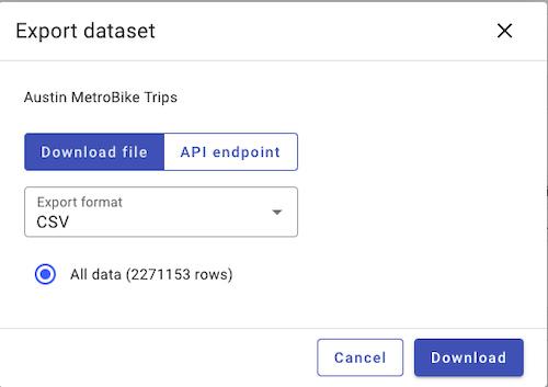
| 5 | Single click download | Austin, Chattanooga |
| 4 | Possible to download all data with a single script command (i.e. s3 sync or API) | London, New York City |
| 3 | Data available through downloading data month by month or year by year | Trondheim, Mexico City |
| 2 | Data available in unconventional way | Taipei, Helsinki |
| 1 | Data available, but it's miserable to access | Guadalajara |
Austin and Chattanooga shine in accessibility by providing single-click exports for their entire dataset, allowing users to download every trip in one go. However, it’s worth noting that both cities handle relatively low volumes of bike rides. Larger cities might struggle to in keeping down the file size.
For those without single-click downloads, other cities offer good alternatives. Toronto stands out by providing both a developer-friendly API for programmatic access and a user-friendly interface for downloading data by year. Similarly, bikeshare systems operated by Lyft, such as those in New York City and Boston, store their files in an S3 bucket, enabling developers to sync all data with an s3 sync command.
For those that don't allow single click download, some other cities offer reasonable options. Toronto provides both an API for developers to download the data programatically, and a UI where those less technical can click and download each year of data. Similarly, bikeshare systems operated by Lyft, such as those in New York City and Boston, store their files in an S3 bucket, enabling developers to sync all data with an s3 sync command.
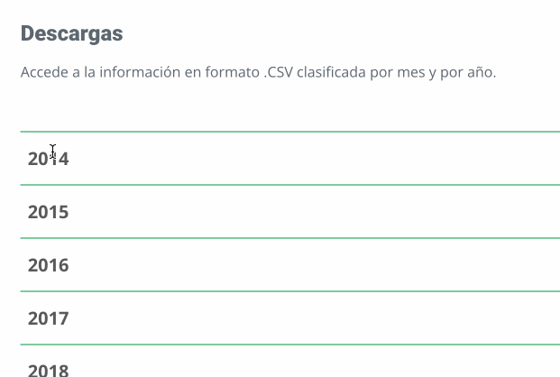
Most cities like Trondheim and Mexico City offer data downloads organized by month or year, which is functional, but time-consuming for non-developers who want to download the full set of data, but are unable to write a web scraper.
Some cities, like Taipei and Vancouver, complicate the data access process. Taipei requires users to download a CSV file from its open data site, which then contains links to monthly datasets, a two-step process that’s cumbersome. Vancouver takes a similar approach, storing its data in Google Docs, forcing users to navigate to individual monthly files and download them manually. This doubles the number of clicks compared to most other systems.
Finally, Guadalajara earned the lowest score because it has a baffling UI experience that will deter all but the most determined users.
Processing Challenges
Cities who score high on the processable spoke are those that require minimal handling of incompatible data structures, data types, or other edge cases, such as invalid datetimes, typos, or lossy characters.
| Score | Criteria | Example Cities |
|---|---|---|
| 5 | Processing is as simple as reading all the csvs, renaming the columns to the final column names, and merging them together. | Austin, Bergen |
| 4 | Processing hits small bumps due to files at most 2 different data structures (csv headers), date formats (i.e YYYY-MM-DD and MM/DD/YYYY), but has no other issues. | Philadelphia, Taipei |
| 3 | Processing has more than 2 different data structures and date formats. May also contain some other processing steps such as casting types and mapping dates with two digits to four | Montreal, New York City |
| 2 | Processing requires handling many different inconsistencies, such as typos, extra empty rows at the end of the file | Mexico City, Vancouver |
| 1 | Data cannot be processed at all |
Austin and Chattanooga score the highest because they provide their data in a single csv file, which requires a single set of headers for the data. Most systems allow users to download monthly data, each of which can have a different set of csv headers and date formats. For the most part, these changes are not documented, leaving those interested to stumble through these inconsistencies as they attempt to process the data. There are a few cities, however, that have maintained a consistent structure throughout all their monthly files, and these cities also scored the maximum 5 for this category.
To score a 4/5, bikeshares needed to have at most two sets of csv headers across all their files and two separate datetime formats.
Those scoring 3/5 may have had three or more different csv headers for their trip data, or contained other challenges in processing data, such as weird datetime formats, having lossy characters in station names, or using inconsistent years (2016 vs 16).
Only two cities cored a 2/5. Mexico City had so many variations in csv headers that it was extremely painful to stumble across all the possibilities when merging the data into a single file. Vancouver, likely because it stored its files in Google Docs, contains files that have tens of thousands of empty rows that need to be filtered out.
Keeping Things Fresh
Norway's cities are best in class in updating their data daily. London is second, updating on a biweekly basis. Almost all other cities update on a monthly basis. Some cities like Chattanooga and Taipei seem to only update their data if they're specifically asked. Austin is the only city where the update frequency is unknown, since they stopped updating in July. Despite inqiuries, they have not responded about when they may resume updating their data.
| Score | Update Frequency | Example Cities |
|---|---|---|
| 5 | Daily | Oslo, Bergen, Trondheim |
| 4.5 | Biweekly | London |
| 4 | Monthly | Columbus, Washington DC |
| 3 | Bimonthly | N/A |
| 2 | Upon Request | Taipei, Chattanooga |
| 1 | Unknown | Austin |
Documentation
In general, documentation and description of the data is poor. Norway's cities once again score the best, providing the exact dates when the data structure changed and sample data for each variation.
Scores broke down in this fashion:
| Score | Criteria | Example Cities |
|---|---|---|
| 5 | The city documents the exact csv headers available for each data set, including legacy data. Provides example data that shows data formats and data types | Oslo |
| 4 | The city documents structure of the latest files are documented, but does not document the structure of legacy trips. Or it may be possible to preview files on the website to see examples of the data. | Los Angeles |
| 3 | The city explicity lists the data that's available, but not the exact csv headers. The | Washington DC |
| 2 | The city roughly describes what data is available. | N/A |
| 1 | No documentation provided | Mexico City |
City by City Evaluation
Austin
Austin
Austin's data is just a bit weird. In terms of the data, it's of the highest of quality - 100% data complete, and a single data structure for straightforward processing. Along with Chattanooga, Austin has the best data download process. One click of an export button, and all the data downloads in a single excel or csv file.
Austin does make an odd choice of including only start time, and duration (in minutes) rather than the typical start and end time almost all other bikeshare operators use. They also have columns for checkout datetime, checkout date, and checkout time even though only checkout dateime is required for completeness. Some minor weird data decisions aside, what prevents Austin from reaching greater heights is it stopped updating data on July, 2024, which corresponds to a switch of operators. We'll see if the new operator, CapMetro, will continue to make bikeshare data available for all.
Boston
Boston
With less than 0.1% of its trips missing data, Boston’s dataset is nearly complete. Downloading the files is a smooth ride, as Boston, like many of the Lyft owned bikeshare systems, makes its data readily available in an S3 bucket.
However, like Boston’s famously winding streets, the data has a few twists and turns to navigate. Some datetimes are recorded to the millisecond, which clashes with all the other datetimes in seconds. Additionally, the column headers for the CSV files changed around 2023, but unlike Oslo, Boston doesn’t document this change, leaving users to map out the differences themselves.
One feature worth highlighting is a story map on their website, which offers an interactive visualization of how the bikeshare system has grown. It even highlights popular stations and destinations by neighborhood, giving users a clear view of the system’s evolution.
Chattanooga
Chattanooga
Chattanooga might be the smallest city by population that makes its bikeshare data publicly available. Bravo! They use a data system similar to Austin's where developers can export all data into a single file at the click of a button. Because the data's in a single file, all data follows the same format for easy download and easy processing. A+ on this front.
Chattanooga fall shorts mostly because its data is very stale. As of November 2024, the last publish date was February 2024, and this data did not only included data up until the end of 2023. On request, Chattanooga was able to update this data for 2024.
Chicago and Columbus
Chicago
Columbus
Processing Chicago data starts off great with a simple S3 bucket sync, but quickly goes downhill from there.
Prior to 2020, Chicago's bikeshare rarely had any missing data values. Perhaps coinciding with Lyft's takeover in 2019, the data quality drastically declined. Now every month, the data has gaps, sometimes missing start or end station names, sometimes both. The result is over 11% of Chicago's trips have missing values.
To parse the data, Chicago has three different data structures in tis csv files, including one truly baffling set, which includes column headers formatted like "01 - Rental Details Local Start Time". Even more frustrating, Chicago's time columns come in two different date formats (YYYY-MM-DD, MM/DD/YYYY, MM/DD/YYYY), and two different time formats (HH:MM:SS and HH:MM), combining for a total of four different flavors.
Columbus performs slightly better than Chicago with less than 10% of its trips missing data, and has only two variations in dateteime, making it slightly simpler to process. These minor improvements, however, are not enough to bump into the the next tier.
Guadalajara
Let's start with the good. Guadalajara's data is 100% complete.
If only if it were easier to access as downloading the files through the UI was the most frustrating among all the cities. For example, users first need to click a year dropdown, which brings into view the links for each month. Upon clicking and downloading one month of data, however, the entire year dropdown closes as shown below
Guadalajara is so close to being perfect to process, but has two minor hiccups. The first is that birth year headers can either be Año_de_nacimiento or A�o_de_nacimiento, seemingly a failure to consistently handle the ñ across files. The second is for four files, they chose to use a MM/DD/YY format rather than the YYYY-MM-DD format used for every other file. Besides these minor glitches, however, the data runs through the pipeline smoothly.
Interestingly, Guadalajara is one of the few cities that still provides user_ids, gender, and birth_year for current data. Many of the US Bikeshares used to share this information, but stopped sharing due to what I assume are privacy reasons. This makes it so that analysts can see how heavily certain users rely on bikeshare for their day to day transportation.
Helsinki
Helsinki
Helsinki has one of the odder ways for accessing files, which is directly through the url. Users can choose to either download monthly csvs at:
dev.hsl.fi/citybikes/od-trips-[year]/[year]-[mm].csv
Or through yearly zip files at:
dev.hsl.fi/citybikes/od-trips-[year]/od-trips-[year].zip
This makes grabbing the data really awkward for anyone non-technical as they have to constantly change the year and type rather than the click and download approach at most other open data sites. They do clearly list the months for which the data is available, so one doesn't have to guess at the very first or last date to download.
Once downloaded, the ride becomes much smoother. There's a single data structure across all formats, using a single datetime format for start and end times. And all the data is nearly complete with only 1411 trips over its entire operation that lack some information. If the accessibility and documentation were cleaned up, Helsinki could easily shoot up the rankings.
London
London
Searching for London's bikeshare data leaads to an s3 bucket with an overwhelming number of folders and files that includes both general cycling counts, cycling parking, cycling routes, and of course, bikeshare data. Unlike the Lyft operarted US systems that also place their data in s3, there is no guidance on how the data is structured or what is present in the s3 bucket. The readme is hilariously unhelpful, containing only the following text:
The file "cycle-parking-map-info.zip" is used to load the cycle parking points in the api. These are then displayed on the map pages. The zip file should be updated when we want to add new cycle parking points.
Instead, users are on their own to understand the folder structure and that all bikeshare data exists under the usage-stats folder. There are still more bumps even after finding this path, however, as files before 2015 are stored as zip files, containing data for the whole year, but those after are stored as csv files. Once properly downloaded and unzipped, London's data isn't too hard to parse through. There are three sets of data structures to account for and two time formats, but this is pretty consistent with many other cities such as New York City.
On the bright side, London is the only city that updates its data every two weeks, which is more frequenty than every other city except the Norwegian cities.
Los Angeles and Philadelphia
Los Angeles
Philadelphia
These two cities are rarely linked, but both Philadelphia and Los Angeles are both operated by Bicycle Transit System. Philadelphia has complete data while Los Angeles is close. The data structure for both cities is well-documented, with a consistent structure spanning the entire history of their data. However, analysts must negotiate two datetime formats. Overall, though, the data is a joy to parse. I also appreciate how Los Angeles explicitly documents its data processing steps, such as removing trips lasting over 24 hours.
Both cities also offer dashboards that showcase total trips made, passes sold, and the overall benefits of their bikeshare systems, including calories burned, miles traveled, and emissions reduced. That said, I wish bikeshare companies would stop projecting emissions reductions without proper context—it's impossible to know whether a rider would have walked, taken the bus, or skipped the trip entirely. Alternatively, they should transparently explain their calculations. Are estimated miles for every trip converted into gas savings? Or are only a certain percentage of trips included? While well-intentioned, such claims can be misleading without clear details.
This issue does not overshadow that Bicycle Transit Systems has done a great job having high quality data that's complete and easy to process. With their recent acquisition of BCycle and bikeshares in more than 30 cities, I hope they continue to publish quality data for its new cities.
Mexico City
Mexico City
Mexico City really should belong in the C tier based on its data completeness, but its data is miserable to process. It's common for cities to have two or three sets of data structures, each corresponding to a different operator. Mexico City, however, has column headers with minor variations, or even typos. For example, the arrival date (fecha arribo), is sometimes labeled as: Fecha_Arribo, Fecha_arribo, or Fecha Arribo. In the June 2021 file, there were two identical headers of Hora_Arribo, but one was intended to be Hora_Retiro. With so many variations, it makes sense Mexico City does not bother to document them. Developers will need to stumble through them to successfully parse the data.
Mexico City also only provides start and end station ids, but not start and end station names. Using Mexico's current station names, only some of these ids are able to get station names. It's impossible to get the
Montreal
Montreal
With North America's third largest bikeshare usage (behind New York City and Mexico City), Montreal trips with missing data is middle of the pack. More concerning, however, is that nearly all of the missing data is from recent year data. Prior to 2022, there were only 3 trips that had any missing data. In 2022, that number surged to 74,035 trips, followed by 71,155 trips in 2023, and 49,199 so far in 2024. For 2024, this would mean about 0.6% of trips contained null data.
Parsing through Montreal's bikeshare data is challenging. To start, there are three sets of data structure changes to slog through. In two out of three sets, the start and end station code is provided that needs to be mapped to station name, whereas the most recent data structure directly uses the names. The latest data also uses epoch time for start and end time requiring additional time parsing.
One of Bixi's best features is already visualizing its current year data for visitors, even allowing users to explore different aspects, such as comparing purchases vs trips, and trips made by members vs one off users. Visitors can also switch the year to see how the trips have changed over time. Nice!
New York City and Jersey City
Jersey City
New York City
New York City
Jersey City
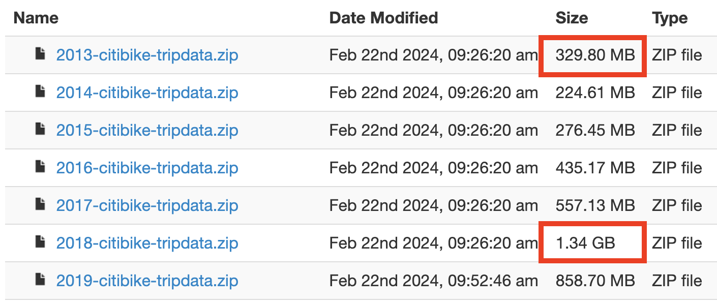
New York City and Jersey City data are all available in the same S3 bucket for download. While overall the data completeness is high, all the missing data has come after 2020, perhaps coinciding with Lyft taking over operations from Motivate. Just as concerning is that for certain months in 2013 and 2018, there are files that are duplicated so certain trips are counted twice. Note the larger file sizes of 2013 and 2018 compared to subsequent years in the image below.
For NYC, processing the data requires handling three separate data structures, and three time formats, but otherwise is straightforward. Jersey City only uses one time format across all of its three different data variations, making the process simpler.
Bells and whistles wise, New York City's bikeshare data has a couple of cool features, such as sharing the monthly operating costs, NYC's more general biking data, and finally a Google group one can join to meet other bikeshare data enthusiasts.
San Francisco
San Francisco
Not to be outdone by the windy city, Fog City makes its data even harder to parse as 1 in 5 trips have either missing start or end station (or both). The data spotiness covers up any other redeeming qualities of the data, which otherwise shares many of the nice accessibility and usability features of its US Lyft operated peers.
Toronto
Toronto
Toronto stands out as the only city to provide a data quality rating for each of its datasets. The bikeshare dataset currently boasts a quality score of 82%, but by our standards, it earns an A. Full credit to Toronto for leading the pack in self-assessing its open data quality. No other city has attempted such a self evaluation. At the time of writing, I was one of just 82 viewers of Toronto’s video on making its data accessible and measuring quality, but I’m awarding Toronto a perfect 100% for effort in transparency and accessibility.
Toronto’s bikeshare data is nearly flawless. Out of 22 million total rides, only 22 rows have null station data, and 249 rows contain null start or end times. Toronto is also one of the few cities to offer an API for retrieving its data, with support for Python, Node.js, and R.
Of course, even a smooth ride has minor bumps. Toronto acknowledges one undocumented change to its data schema, leaving developers to navigate variations in CSV headers (fortunately, only two). Some datasets also use two-digit years (e.g., 17 instead of 2017), and time formats appear in three inconsistent formats. Additionally, certain start stations include placeholder characters requiring lossy conversion, such as “Gailbraith Rd / KingG��s College Cr.”, which should read “King’s College Cr.” Despite these quirks, Toronto’s data quality sets a high bar, and their efforts toward transparency make them a model for other cities to follow.
Taipei
Taipei
Taipei's data is nearly 100% complete with only 702 trips with missing data. This is incredible considering the over 93 million trips that have been recorded since 2020, the year when Taipei started tracking Youbike 2.0 trips. This is the only historical data that's available, so we're hoping that Taipei will soon share YouBike 1.0 data as well.
Accessing Taipei YouBike data is challenging. YouBike's main data page does not reference any data for download. Instead, it's found on the open data page where one can download a single csv. Each row in the csv contains the link to a month of data, so this is a two step process that developers need to hop through to get monthly data.
Once downloaded, Taipei's data is straightforward to process. One interesting quirk is they provide start time, precise only to the hour, and the duration of the trip, but not the end time. This likely is for privacy reasons, so it's impossible to track where someone ended up if you know their start time. Taipei is the only city that does this, but I can respect the intention even if it makes producing data with consistent data structures across all bikeshares more challenging. What is mildly annoying, however, is the duration is provided in HH:MM:SS format where HH can be over 24, making custom logic necessary for parsing the datetime.
These are mostly minor inconveniences, but like Austin, what really drags Taipei's quality is the infrequent data updates. In August, 2024, the data had only been updated up to February, 2024. After requesting more data, a government official did respond and provided updated data until June. It seems that data is only updated upon request.
Trondheim
Trondheim
Trondheim falls just short of the high standards set by Norway's other two cities because it has 983 trips that lack start and end station names. While this is disappointing by Norwegian standards, it is still far better than the data quality of almost all other bikeshare systems. Aside from this minor glitch, Trondheim shares the same high-quality data as Oslo and Bergen.
Vancouver
Vancouver
My journey to process Vancouver's data took me for quite a ride. Vancouver is the only city to store its data on Google docs, which I suppose may be cheaper than storing it in an s3 bucket and paying for access costs. This makes it slightly more painful to download all its data both for technical folks writing a script and for non-technical folks needing to click a link and another download button for each file.
On initial processing, I found Vancouver to have over 20% of its data incomplete, only to later realize that Vancouver adds tens of thousands of new lines at the end of its csv files. Once these were processed out, Vancouver's data was near complete, but this random addition of empty rows really should be cleaned up by the data provider.
Unlike many bikeshare bikes, Vancouver's Mobi bikes allow for stopovers, so one can lock their bike anywhere for a brief period. The number of stopovers are recorded for each trip, providing a richer set of data for analysts.
Washington DC
Washington DC
Washington DC data has even more gaps than New York City's, and like NYC, most of it missing data comes after 2020, spiking to over 1 million trips with missing start or end station names in 2024. DC's data is easier to process than NYC's with only two data structures, and only one time format.